Why back-office is as crucial to user experience – and your bottom line – as the front-end
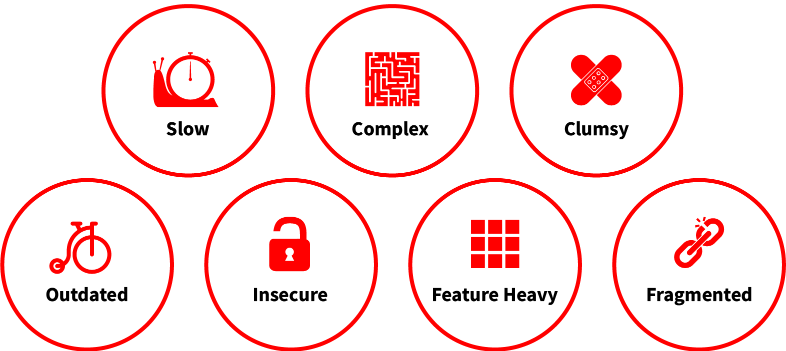
A non-intuitive, outdated (and let’s be honest, often ugly) back-office devalues all the effort you put in at the front-end… and *plot twist* it’s costing you money. Slow, complex, clumsy, and far from human-centred, it can drastically reduce the speed, quality and value customer service provides. But more than that, it’s likely masking a ton of insights and performance data that drive profits up and to the right; as well as leaving your best people far from engaged.
At the core of a back-office rebirth is user research.
It’s not obvious, until it’s obvious
The value of upgrading customer-facing digital interfaces is well understood as a worthy investment. Directly tracked against acquisition and retention rates, engagement and spend it gives businesses demonstrable metrics for ROI. So why is the value of an internal system (the very thing that keeps your engine room optimised) not seen in the same way? The answer is probably a mix of:
Fear – what you find when you start poking around
Clutter – how much you find when you start poking around
Scale – what level of time and budget you’ll need to sort it out
The great news? They’re all surmountable.
From clutter to clean sheet
At the core of a back-office rebirth is user research. Perceived assumptions often don’t match the lived experiences, priorities, needs and pain points, as well as the everyday routines and duties of different user roles. These insights typically offer up deeply valuable information about what’s wrong, and the associated feeling; like:
Simple tasks being convoluted and time-consuming – user feeling unproductive
No visible summary of KPI progress – user feeling unsuccessful
Making physical notes to access complicated features – user feeling worried about mistakes
Collating data from many different sources – user feeling pressure to manually (and accurately) join the dots
This generates a set of user personas and usage scenarios that put digital interactions into context and translates them into a matching architecture. Which in turn naturally strips out the unnecessary clutter to create the most logical, efficient, and streamlined system by purposeful, heuristic design.
What’s scary about that?
A human-centred experience
Perhaps the most pivotal moment in any back-office redesign is seeing this new architecture silhouette as a working, interactive digital prototype. It enables:
User journeys to be validated, tested, and iterated on
Page layouts, best-use of screen real estate, visual impact, and moments of joy to be applied (e.g., gamification, motion)
Key user groups to feed into usability, hierarchy, and accessibility refinements at priority milestones
The final brand treatment applies a fresh look and feel to what has often been a colour-less, table-view style layout (‘Windows 98 vibes’). Designing for focus and joy incorporates:
Creative and considered colour palette and font choices
Accessible, intuitive, and informed styling for features and buttons
Dynamic data visualisations
Injecting brand elements for personalisation
Opportunities for customisation (at user group or single user levels)
So, it’s all thought-through, tested, designed, and branded before it goes near a developer. Must be expensive and take ages, right?
The internal revolution
The time it takes to review and redesign a back-office environment is of course unique to every business. As a guide, we recently redesigned a new system for an iGaming client, broadly consisting of 30 screens with additional interactive elements, to meet the needs of seven different user types who were interviewed in the research phase. It required a structural rethink, as well as a full creative and brand execution. In sixteen weeks, we delivered the complete prototype ready-for-build.
It represents an investment, with less obvious and accessible ROI metrics – there’s no getting away from that. But what’s more likely to yield a greater return:
An outdated back-office that demonstrates a modern digital approach is not valued for employees (only end customers). And a digital product that’s fragmented, overloaded with functionality and a navigational nightmare that isn’t promoting job satisfaction or success; or
A back-office that’s designed with users to increase service speed, employee productivity and customer satisfaction… That reduces the learning curve of employees from weeks to days (even hours); and decreases the potential for costly human errors. Oh, and potentially serves up insights that could lead to growth and expansion.