What does it take to re-design the entire front end (desktop, mobile and native app) for a lottery operator?
This blog post steps through a version of that process with a real-time example – peppered with some mind-bending stats to highlight what was really involved. And, how engaging a specialist UI / UX design studio truly adds infinite value to any iGaming product.
Our brief
The client’s primary challenge was an archaic mash-up of legacy tech – two disparate CMS systems holding the platform together, plus a lottery engine. Also, a front end that wasn’t working for players experientially or visually, significantly impacting profitability.
The project was also quite unique from a design perspective. Our brief was to create and produce every single platform screen – where ordinarily a template approach might be deployed to save time and resources. But no interface project is linear, and often the process becomes personalised to project specifics and intricacies that are individual to every client.
This is how we tackled it:
- First, we explored the current site map and navigation across the whole platform. Navigation design is the discipline of creating, analysing and implementing ways for users to move through a website or app – in the least frustrating way possible. We employ a combination of UI patterns including links, labels and other UI elements that provide relevant information and make interacting with products easier.
- At a workshop with all key stakeholders we then presented the proposed new site map, to garner feedback and viewpoints from all corners of the business. Collaboration really is king at this very early stage in the project – getting everybody aligned and reflecting all considerations into a final site map, creating super strong project foundations.
- The next stage is concepting. For this lottery operator, we created both homepage and game page concepts – interrogating the existing interface, competitor and comparator platforms, and applying best practice UI principles to culminate in a recommended route forward.
The core project team comprised 3 project managers, 2 C-level execs, 5 designers, 4 developers, 2 product managers, 2 marketeers, 1 data scientist
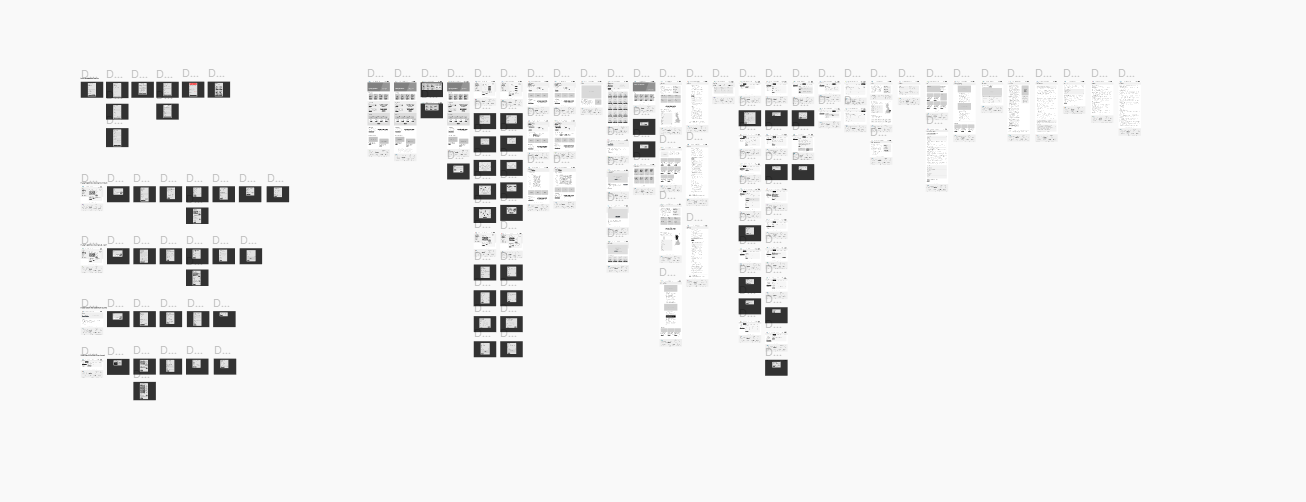
- Tying up the navigation design, site map and chosen concept we performed a complete audit of the homepage structure in greyscale (no application of styling, colour or branding yet) in our Figma design environment. This included a first pass at link building (out and in) from the homepage, creating the first iteration of the product as an interactive prototype.
- A series of weekly workshops with stakeholders ran over a six-week period, interrogating and wireframing key pages related specifically to the lottery engine. By now, the Figma prototype is starting to represent a much fuller product experience with clickable links, enabling project owners to iteratively test and refine in real-time.
- In our final wireframe phase, all static pages are added into the Figma prototype (everything outside of the lottery engine) with working links, buttons, and interactions. This is rigorously reviewed by multiple collaborators in real-time, with transparent modification trails and comments for an agile workflow – crucially, de-risking ahead of investing time and resources into creating the fully functional product.
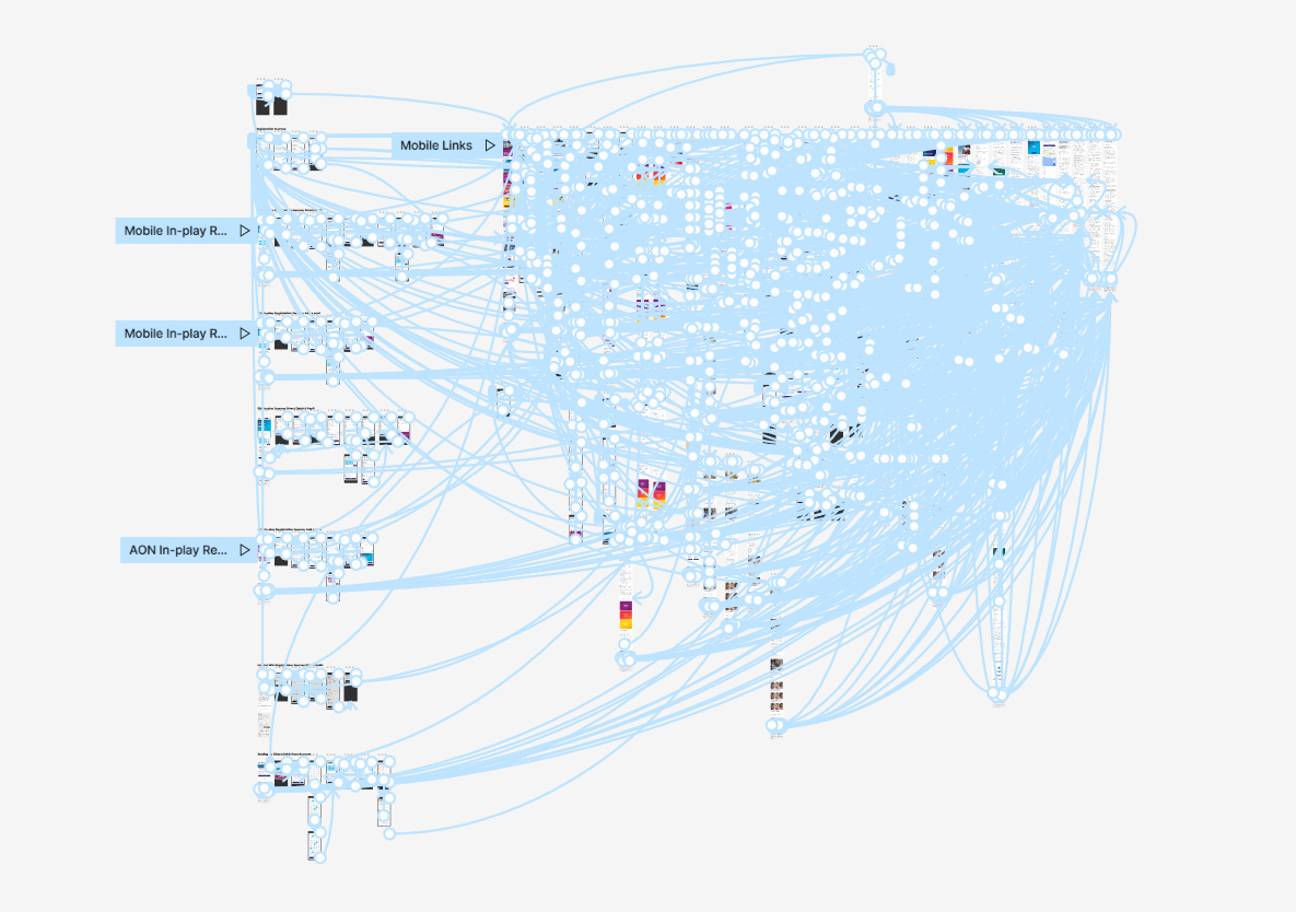
The prototype contains 617 screens, and 8,123 links (80% of which are linked by-hand in Figma) with a total word count of 82,122.
- Bringing the prototype to life with design is the next big step. Creative is applied to all greyscale screens, starting with a selection of the most prominent landing and core functional pages. This entailed creating a new front end design language (integrating refreshed brand identity and visual elements) for the platform – and, arguably, also the brand. Alongside injecting user experience and best practice design principles, our side-goal was also to create consistency across all digital collateral for the operator.
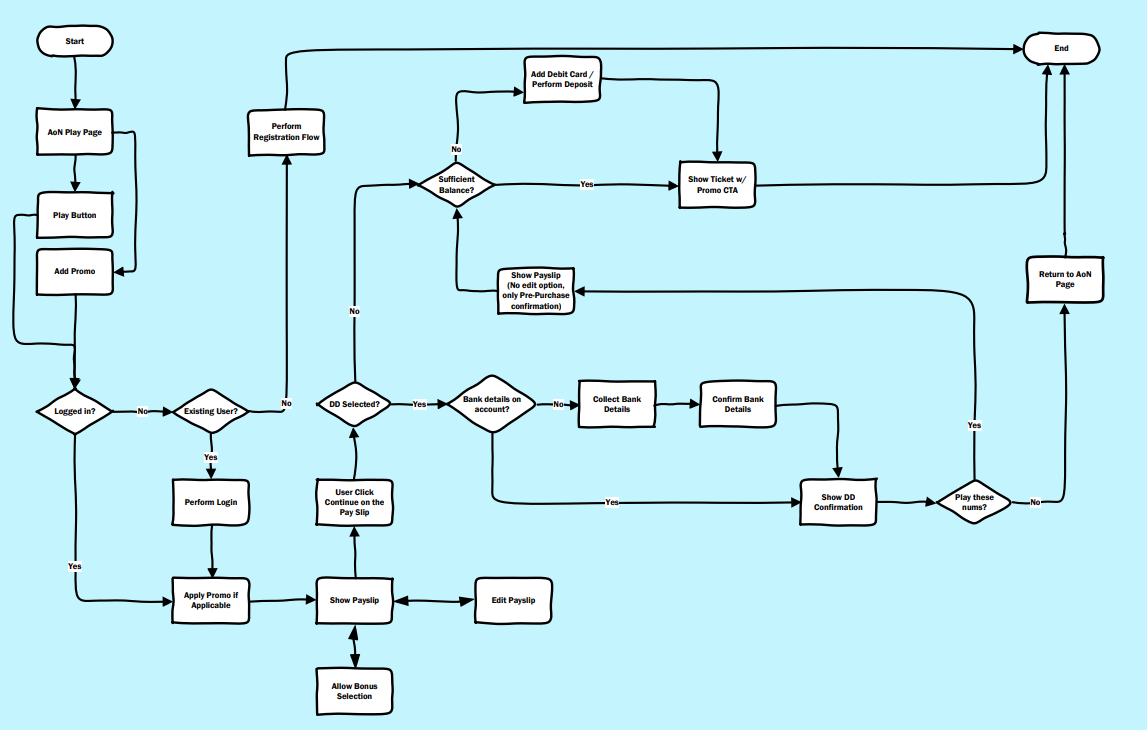
- Exploring use case journeys represents the final piece of the puzzle. These are standalone journeys that relate to a specific user action, for example player registration. By refining the existing journey and re-defining entry and exit points, we created four different iterations (e.g. those who want to PAYG or set up a direct debit, etc).
We produced a whopping 67,386 design layers across desktop and mobile. Plus 44 standalone user journeys. As a guide, just the flagship lotto game on desktop comprised 8 user journey variations and over 5,000 design layers.
- Prototype iteration is possibly the most intense – and critical – of all the phases in a platform re-design. This is where the prototype is continually tested and re-tested through a variety of lenses, and by multiple collaborators and stakeholders, to fine-tune every individual element. At this final juncture, we are ensuring that every snag is course-corrected, every link is mapped accurately, every journey aligns with the use case… The ultimate aim: A smooth handoff and a frictionless build.
- Finalising select native app screens comes once the desktop prototype is signed off. Rather than build everything again within the app, mobile web wrapping recreates the majority of screens (delivering a significant time- and cost-saving). Our role is to create only those app screens that fall outside of wrapping and require a custom design.
- The finish line! With steps 1 – 10 complete, we are now ready to handoff the Figma files to the development team 🙂
Over 370 studio hours have been invested into the project so far, and we’ll remain in play to QA at key milestones throughout the dev phase.
Share this post